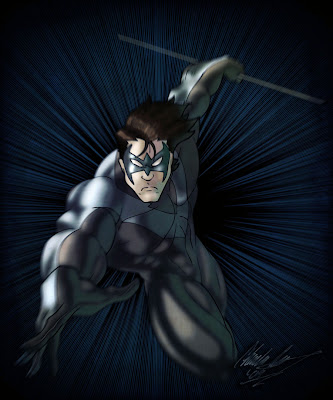
This one is of Nightwing, aka Dick Grayson...aka Robin. This is a work in progress and a small part of a much larger intended picture. I would go into specifics, but I don't want to say anything just yet until I put it all on paper. Basically, I just wanted to show the work in progress from the initial 'ink' stage to the colors.
I'm the cheapest artist I know. And it also doesn't help that I don't get paid for commissions (see previous post), so I gotta keep stuff cheap. But that's going to change soon when I make that serious jump. Anyways, my pen is dying on me and I'm trying to get the most out of it, but its becoming an exercise in futility. I tried to do the best that I could with what I had. I definitely need to get some new pens if I plan on finishing this drawing.
So, these are the coloring stages I take. I first lay down the flat colors just to make sure that things will flow well together. Then I decided on how I wanted the lighting to go...which in this case I wanted the light to come in from the viewer's left. I shaded the face first to make sure it looked okay, then proceeded to the rest of the picture. Then I put in darker shadows and then the highlights. Here's that progress:

And the background is babyfood pea green because it helps me to see the whites easier.
Usually, I would leave things that way, but this time, I decided to add a secondary light source, which I think helps out greatly, even though it isn't immediately obvious. I thought that the image looked cool, so I decided to make it a picture on its own. I added the comic screen tone to the back and did a radial motion blur and added an overall texture, and this is how it came out in the end:

Meh...it looks okay...not fantastic. There's some things that I still have to change here and there on it. I just really hope that the larger picture comes together and is coherent.


2 comments:
I still don't have the foggiest how you create these, but I like it :-)
Okay? Not fantastic?
You REALLY gotta give yourself more credit dude... your shit be fly as hell.
Post a Comment