Google+

  • Now Selling Prints!!

    I'm now selling prints through Storenvy! Go buy a few!!

  • Follow Illumistrations on Tumblr!!

    Follow me on Tumblr at Illumistrations.tumblr.com

  • Questions or Commission Requests?? Email me!!

    carrington84@gmail.com

  • Follow Me on Twitter!!

    @Illumistrations


Showing posts with label From Start to Finish. Show all posts

Friday, February 28, 2014

Snow White

No comments:
Even though I haven't been posting on a regular schedule, that doesn't mean that I haven't been drawing.  I've been working on commissions and doing sketches here and there trying to keep my mind loose.  One of the sketches that I did in between commissions was that of Snow White.  I drew a version of her a while ago...but I really didn't like that one.  I didn't like it when I posted it originally...I just posted it to keep posting art, so I knew that eventually I would have to go back to the idea and do it all over.

So below is the initial sketch that I had in mind for the Snow White illustration:

art illustration artwork drawing sketches disney princess princesses snow white illumistrations african american women woman black

Lately, I've been doing very loose sketches, but this one was pretty well defined...and I'd blame that on commissions, which definitely isn't a bad thing.  At least this way, I knew exactly where I wanted to go with the final drawing.  I had an idea of having everything around Snow White decaying because of the poisoned apple, and it still doesn't sound like a bad idea.  Actually, I may do that one as well...but anyways...

Below is the final illustration:

art illustration artwork drawing sketches disney princess princesses snow white illumistrations african american women woman black

I'm very pleased how the final version came out, and even did some experimenting along the way.  I think with each drawing that I do, I learn something new, which is definitely a great thing.  And as always, if you would like to purchase this as an  11" x 17" on high quality gloss cardstock paper, you can always do so at my Storenvy site.

Oh, and follow me on Tumblr, Instagram, Facebook, Google+ and all that jazz...I post some work in progress stuff there and other random stuff too.

Without Wax,

-Charles

Monday, February 10, 2014

Long Distance Relationships

1 comment:
Long distance relationships can be hard to maintain, but in the end, they're totally worth it.  No matter how many times you travel to see your significant other, you still get butterflies when you're on your way and almost there.  So, I guess I wanted to try and capture that.  I don't really do much storytelling with my drawings, they're usually just 'snapshots' I guess, so this was something a little different.  Below is the sketch:

black art african american art woman women drawing bus ride train long distance relationships relationship tumblr illumistrations sketch drawing

This also turned out to be a coloring exercise with transparencies and glass...as well as reflections and related things.  Below is the final image:

black art african american art woman women drawing bus ride train long distance relationships relationship tumblr illumistrations sketch drawing

Its great when you can draw something thats based on reality and something that you know and are familiar with.  It gives images I guess a sense of realism that just seems grounded.  As always, if you would like to purchase this image as an 11" x 17" print on high quality gloss paper, I can direct you to my storenvy store where currently I'm offering 15% off for Valentine's Day.  Just use the discount code VDAY14 to get 15% off.  

Back to the drawing board!

Without Wax,

-Charles

Monday, February 3, 2014

The Worst

No comments:
I've been a fan of Jhene Aiko for quite some time.  After I heard her song with Miguel about 2 or so years ago, I've been hooked on her music ever since.  Then her newest EP came out, Sail Out.  And there are some great songs on there (notably the one she has with Kendrick Lamar), but it's her The Worst song that stays on repeat.  And then the video...the video is great and makes me love the song even more.

So, with a suggestion from a special someone (thank you!) I decided to do some fan art of her based on the video.  So first, obviously was the initial and hen tightened up sketch of her.  I wanted to base it off of the video, but not from a shot from the video, if that makes sense.  Anyways, the sketch is below.

art sketch illustration jhene aiko the worst video fan art illumistrations drawing

My perspective is all wrong (the blinds) in the sketch, but that usually happens when I sketch stuff out and then I go back when I ink it and fix it (most of the time).  And below is the final image:

art sketch illustration jhene aiko the worst video fan art illumistrations drawing

If you haven't checked out her music, I seriously suggest you do so.  And as always, if you would like to purchase this as an 11" x 17" print, you can do so on my Storenvy page.

Without Wax,

-Charles

Monday, January 27, 2014

Untamable

No comments:
Since I've been getting very loose with sketches recently, I decided to keep my sketches a little tighter this time, and this is what came out.  I say that you shouldn't let other people dictate what you do with your hair or how you wear it.  Do what's best for you, and only you really know exactly what's best for yourself.  So below is the sketch after I went over it again and tightened the pencils up a little bit.

art illustration sketch black african american woman women natural hair curly hair artwork black art

And below is the final illustration.  I decided to make her shirt a Minnie Mouse shirt and gave her a tattoo to her side as well.  It was hard trying to decide how to put glasses on Minnie Mouse and make it look aesthetically correct, mainly because her eyes are too close together and her ears are too high upon her head, so I made some compromises that seemed to work out well.  

art illustration sketch black african american woman women natural hair curly hair artwork black art

Per usual, this illustration is up for sale in 11" x 17" size on gloss cover paper on my online Storenvy storefront.  Feel free to browse and even buy a print or two!

Without Wax,

-Charles

Saturday, January 25, 2014

Selina Kyle

No comments:
It's been a long while since I've drawn Catwoman...like a really long while.  If I were to guess, I would say somewhere around 4 years or so.  That means this was long overdue.  The drawing that I did 4 years ago was very similar, but it appears that I may have deleted it, so I can't really use it for comparison purposes.

But I know for certain that this one is better, just take my word for it.

I've noticed that recently my sketches has been looser and less refined than I used to do them.  I guess that means that I just fudge areas in sketching and will define them more when I'm inking and coloring them.  Good thing that I'm the only one completing my work from sketches to finishes, cause an inker and colorer would probably hate me.

art sketch illustration artwork drawing catwoman selina kyle comics dc batman gotham african american black superheroes superhero woman women


I guess the sketch does serve its purpose though, I get the main figure down pretty much (even though some adjustments have to be made) and it gets the general idea across.  And below is the final image:

art sketch illustration artwork drawing catwoman selina kyle comics dc batman gotham african american black superheroes superhero woman women

I think it came out pretty well.  I may go back in later and make the light source coming from outside the window more pronounced, but who knows.

If you would like to purchase this illustration as a high quality 11" x 17" print, you can do so (as well as view my other prints) on my Storenvy site.

Have an awesome weekend!

Without Wax,

-Charles

Wednesday, January 22, 2014

The Electric Lady

No comments:
Lets just put this out there, I love Janelle Monae's Electric Lady album.  There, I said it.  Its like a different sound of R&B and just music in general that's just refreshing.  So, if I like something, chances are that fan art is definitely on its way.

Yep.

I decided to draw Janelle as a semi robotic cyborg after her other persona Cindi Mayweather.  I had this idea during the sketch that she would be sitting in this chair plugged into a stereo system, which probably didn't come off all that well, but the speakers are definitely visible in the final image.  I tried my best to put this image online and tag Janelle all over the place on Tumblr, Twitter, Instagram and Facebook, and if she reposts it or shouts it out...I would seriously lose it.  Anyways, below is the initial sketch concept.

art sketch illustration drawing black african american janelle monae cindi mayweather android electric lady illumistrations cyborg


And here's the final image below.


art sketch illustration drawing black african american janelle monae cindi mayweather android electric lady illumistrations cyborg

And if you haven't done so already, check out her album Electric Lady.  You would not be disappointed.

If you would like to purchase this image as an 11" x 17" high quality gloss print, you can do so here on my Storenvy page.

Without Wax,

-Charles

Thursday, October 31, 2013

Fall

No comments:
I love the changing of the seasons.  I love the Spring because the weather is just perfect...plus I'm a lil biased since my birthday happens to be in April.  I love Summer because there's so much to do and so much happening in the Summer.  I love the Winter, basically because of the holidays, but not the cold weather...not at all.  And Fall...well, because of the fashion.


art illustration fall fashion black art sketches illumistrations scarf indian style

Without Wax,

-Charles

Wednesday, July 17, 2013

Summer Heat & Sailor Moon

No comments:
I always seem to update every other online space that I have first before updating my original Blogger blog...which is something that I definitely need to change.  I still find that this blog has a lot more information in it than my other spots like Tumblr, Facebook or even Google+, so this one definitely needs to remain a priority.  But since I've been gone, I've been doing a lot of sketching (and finalizing some illustrations).

The first one I did was definitely summer themed.  I think the whole idea for this one came from July 11, or 7/11...the day that 7 Eleven gives away free Slurpees.  Yeah...and with that said, this happened.

summer, heat, african american, woman, summer heat, illustration, drawing

And for no apparent reason, I wanted to draw Sailor Moon (yes, I know...again...).  But this time without her fellow Sailor Scouts.  And I wanted her to look more imposing, than the bumbling way she was depicted in the cartoon.  Initially when I first sketched her out, I wanted to do my own take of her costume and give her like a sailor themed coat and all this jazz, but it looked very cumbersome and too busy, so I nixed it all and started all over.  And this is what finally turned out, from sketch to colors.


african american, black, sailor moon, sketch, drawing, illustration
african american, black, sailor moon, racebent, art, drawing, illustration, artwork

Both of these illustrations are available as 11" x 17" prints.  The Summer Heat one, I'm thinking of doing a limited print, mainly because I need to fill out my portfolio, but if people actually like it, I will offer it more.  And don't forget to check out either my new Square hosted online store, or my other "store" hosted on this very blog!

Gotta keep that pencil busy.

Without Wax,

-Charles

Tuesday, May 7, 2013

Girl on a Vespa

No comments:
Well looky looky here...I finally finished something!  As cool as it is to draw fanart of other comics, cartoons, movies and games...its nice once in a while to just draw something else.  It cleanses the palette I guess.

vespa girl purple bike scooter african american black

I always dread having to draw trees because I always tend to make them just look like broccoli really.  I've been trying and experimenting with different ways and techniques, but really, I just want to get to the point where I can render leaves and not have it just look like a glob.  I think that I'm slowly getting there.  I think that this was one of my favorite pieces to do in a while.  

If you're interested in purchasing this 11" x 17" print or any others that I've done in the past, you should hit up the Commissions and Prints link at the top (or just click the link I just posted).

I'm supposed to be doing a coloring tutorial to show my coloring process, but I'm totally slacking on that.  Don't worry, its going to get done, I just have so many other things on my plate right now.  But to make up for that deficiency, I made an animated gif of my process.  It's extremely dumbed down, but you get the gist of it.


On to the next one!

Without Wax,

-Charles

Wednesday, March 20, 2013

Calvin & Hobbes WIP

No comments:

Just a work in progress shot of the Calvin & Hobbes illustration.  The background so far is up in the air, and hopefully it will come together the further along I go with it.  Welp, time to get back at it.

Without Wax,

-Charles

Thursday, March 7, 2013

Supergirl

1 comment:
african american black superhero superheroine heroine Supergirl heroes

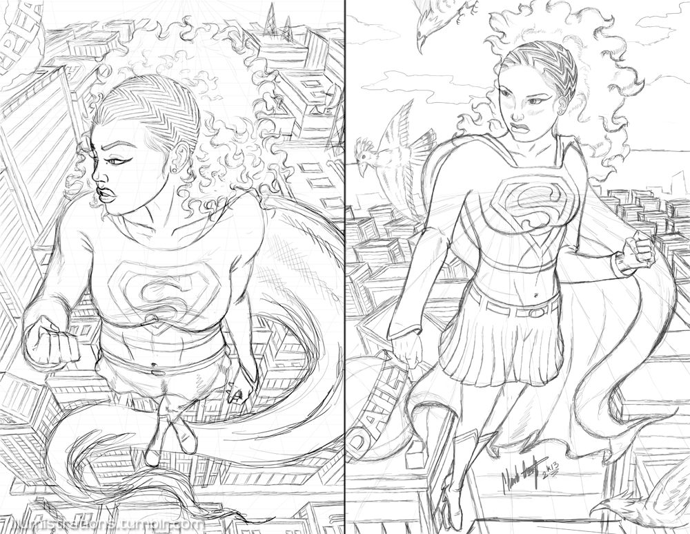
This one was definitely was a while in the making.  I did the original sketch sometime in like early August of 2012 and pretty much sat on it until now.  I liked it then, but I didn't love it enough to finish it, so it sat in the dusty corner of my hdd until I was going through some random folders and saw it.  And then I thought about how I could improve it...
But instead of erasing parts and pieces, I decided to do a completely new sketch without looking at the last one at all...and I ended up not liking that one either.  I liked parts of it, but not all of it.  Then I looked at them both, and decided to use the best of both and combine them into one...the face of the newer one, and pretty much the foundation of the first...well....pictures speak louder than words.

Supergirl african american black sketch comparison

This happens a lot actually.  I'll sketch something out, and it will just dwell forever in purgatory until I randomly see it again and try to fix it.  

And I guess as a bonus, here is a work in progress shot of the final image:

This print, as well as others, are available for purchase here.  Also, feel free to become a fan of my Facebook page!  

Without Wax,
-Charles


Saturday, November 27, 2010

Super Girl Process (Continued)

No comments:


Here's more coloring process on the previous Supergirl picture...and it also marks my first time creating an animated gif image, so yay me!

The first step is the flatted picture (with a corrected Super 'S' logo). The second step is the shadow stage. I do this before doing highlights because it adds volume to the picture and gives me a better idea of how things are going to flow and lets me see problem areas ahead of time.

Step 3 is the basic highlights, where I set the light source. I also add depth to her skin like blush to her face, and tan everywhere else. The final step is where I add the rest of the details, like doing secondary light sources (which unfortunately at this resolution you can't really see except under her breasts and arms), color holds on lines...and warming the drawing with an overlay layer.

That's pretty much my process for coloring most of my stuff. This picture is in no way shape or form completed though, because I have to go back and add in a background and make sure that it looks okay and works and all that jazz. Fun stuff. I'll be sure to post that as well.


Without Wax,

Tuesday, April 27, 2010

Supergirl WIP: Stage 2

No comments:
Yesterday, I posted the flat colors of my work in progress picture of Supergirl. Nothing too fancy really, just started with the basic figure, inked it, and applied some flat colors in Photoshop. Fun, fun stuff (*sarcasm*).

Anyways, here's stage 2 of that drawing. I altered her left hand, because it bothered me to no end, and it just didn't look right. This way, it flows better, and fits with the rules of foreshortening. And I added depth to the colors by adding both shadows and highlights based upon where I want the light source to be. Lately, all I've been doing is cell shading, so its great to get some practice in the style that I started with.

Also, to add just a little bit more of dimension to her, I added a purple-ish reflected light source from underneath her to make her pop against the background that I'm going for. Speaking of backgrounds, I have 2 in mind...both of which I may do. The first, and obvious one, is have her flying through the Metropolis cityscape. I may play with angles and such, or I just may keep it simple with 2 vanishing points. The next I wanted to do is have her flying low against a calm river with a full moon in the background and have the water produce an illuminating effect. This may be more difficult than it sounds, so it all depends. If it turns out to be nothing how I have visioned in my head, I'm just gonna scrap that idea altogether.

Stage 3: Backgrounds.


*Make sure you click on the pic to see it in greater detail.


Without Wax,

Monday, April 26, 2010

Supergirl WIP

2 comments:
Its hard trying to find time to do drawings that aren't directly related to my webcomic because whenever I find time to actually draw, I'm trying to devote most of my time to making Redux Deluxe the best that it can be. So, I finished 3 pages ahead of schedule just so that I can draw something entirely different. So, here it is...my version of Supergirl. Its not done right now (very far from it), but I thought that I would chronicle my progress and let you see how a simple line drawing turns into a full illustration.

Basically, right now, its just the underdrawing. Its done on basic computer paper (because I'm cheap) and inked with a Uniball pen and a Sharpie marker for added line weight (again, because I'm cheap). Then I lay down flat colors just to get things right. These hues may not be the final hues at all, because I may adjust them in photoshop to get the continuity and mood that I'm looking for. Right now, I want her to be flying, maybe through the clouds at sunset or something...or that may change too. Who knows...lets just see how I feel and go with the flow.


Make sure to check back periodically throughout the week to see the progress!!

Without Wax,

Thursday, July 30, 2009

Nightwing: WIP

2 comments:
So, still sketchin'...still drawin'...and still entering art competitions.

This one is of Nightwing, aka Dick Grayson...aka Robin. This is a work in progress and a small part of a much larger intended picture. I would go into specifics, but I don't want to say anything just yet until I put it all on paper. Basically, I just wanted to show the work in progress from the initial 'ink' stage to the colors.

I'm the cheapest artist I know. And it also doesn't help that I don't get paid for commissions (see previous post), so I gotta keep stuff cheap. But that's going to change soon when I make that serious jump. Anyways, my pen is dying on me and I'm trying to get the most out of it, but its becoming an exercise in futility. I tried to do the best that I could with what I had. I definitely need to get some new pens if I plan on finishing this drawing.

So, these are the coloring stages I take. I first lay down the flat colors just to make sure that things will flow well together. Then I decided on how I wanted the lighting to go...which in this case I wanted the light to come in from the viewer's left. I shaded the face first to make sure it looked okay, then proceeded to the rest of the picture. Then I put in darker shadows and then the highlights. Here's that progress:


And the background is babyfood pea green because it helps me to see the whites easier.

Usually, I would leave things that way, but this time, I decided to add a secondary light source, which I think helps out greatly, even though it isn't immediately obvious. I thought that the image looked cool, so I decided to make it a picture on its own. I added the comic screen tone to the back and did a radial motion blur and added an overall texture, and this is how it came out in the end:

Meh...it looks okay...not fantastic. There's some things that I still have to change here and there on it. I just really hope that the larger picture comes together and is coherent.

Tuesday, June 23, 2009

SunKist

2 comments:
Ah...gotta love summer, even though spring is my favorite season. But summer just reminds me of beaches, the smell of suntan lotion, half nekkid wimin, hot days, warm nights, half nekkid wimin...nah, I'm just joking. But I really do love summer. I wish I could go somewhere like the beach or something with my sketchpad and sketch out a scene without looking like some creepo stalker, but those are the breaks of the society we live in today. Anyways...I drew this picture which is loosely based upon someone close to me...and I thought you know, it might be a good time as any to post the steps that I take in doing these now, since I've changed my process when I officially moved from GIMP to Photoshop. So here we go...

Stage 1:
Obviously I started out with a sketch first in pencil, and then inked it. I'm still practicing with different line weights to give cleaner lines and such. But basically, the outline of every major shape gets the thick lines, and the smaller, intricate more delicate lines are the small ones. Sometimes it gets kind of cloudy as to which lines are the larger ones, but hopefully its gonna get better with practice. I did however erase the lines in her neck, nose and the highlites of her hair with an 80% opacity so I don't have to do that color holds technique...but I do need to learn that regardless.

Stage 2:
This is the blah part...laying down the flats. Basically, this is the step where I experiment with the base colors and determine whether everything will flow together well or not when things are completed. It helps to use complimentary colors too so things will 'mesh' better.

Stage 3:
This is where I start to flesh out the picture. I added the shadows here. Its best to set upon a definite light source so things will look right when its finished. I already decided that I want the light source to be in the upper left right behind her wind swept hair, so I placed the shadows accordingly. What I do for the shadows is use a soft brush and color them in with black, and then change the opacity, as well as the layer type, usually either overlay or soft light, depending on which one looks better. A note to the wise though, this works for most colors, EXCEPT yellow and some yellowy oranges. When you use it for those, the colors start to look more dirty than shadows, so for yellows, I suggest using oranges for the shadows. Also, for skin tones, its not enough just using darker colors for shadows, some skin shadows require shades of blue or purples for shadows. I leave those layers as normal, just changing the opacity to what looks right.

Stage 4:
This step is where I apply the highlites. And yes I know thats not how you properly spell it, but that's how I spell it. I use a soft brush with a low opacity just to give me an idea of how light would hit different contours. Usually you can leave this layer as normal, but sometimes its best to check either the overlay or soft light options because those can produce good results as well. These are just the base highlites...

Stage 5:
Most people start their backgrounds first...but it makes it look weird to me and I can't concentrate on the colors that I really want to use. Here I knew that I wanted my background framed within a marquee, so I drew that in there with the marquee tool and the stroke option. Here, I added more defined highlites with a slightly higher opacity. The glasses lenses are drawn over the lineart and then set to a low opacity to give that glass look.

Final:
And here's the final. I basically did the background with some marker brushes on a 35% opacity from yellow to dark red, which honestly, could have been done much quicker with a gradient...but whatever. I added the 'sun' in the background with the ellipse marquee tool and filled it with a bright yellow then blurred it. The circles you see are from a screen tone set to multiply, then I added the text. Then I added some horizontal lines with a low opacity and set to color dodge to give that lens flare look. And that's pretty much it. See...anyone can color/draw/create like I can, its pretty easy....

...well, not really, but you get the idea.

Tuesday, May 5, 2009

From Start to Finish: Gambit

4 comments:
Me completing a picture from start to finish is definitely a rare occasion. And to mark this once in a blue moon, only once in a lifetime thing, I've decided to post my process in how I came about to the final product. Keep in mind that I've learned all of this stuff on my own, so I know that I probably do everything posted here the absolute wrong way, or that there are better more efficient ways of going about how I came to the final...but you live and you learn. And if some people who are reading could give me some pointers and useful steps...please believe that it would be greatly appreciated.

So I started out with a rough sketch:
No fancy art pencils here...I've always used regular #2 pencils. This was done with a #2 bic pencil on 8.5"x11" paper. I have a terrible habit of drawing things too big for the paper, and I know I can fix this by using actual comic board or A3/A4 sized paper...but unfortunately, I don't have any. And I don't have a scanner that can accommodate paper of that size. So, the foot and the card at the bottom are too close to the end of the paper...which usually means problems.

The last post I posted a WIP (work in progress) inking of this pic. No special pens used here either. I normall have art Staedtler pens, but this time, microball pens. They vary in size, so I used a heavy thick one for the outline of Gambit, the medium sized one for the outlines of major shapes and parts, and the fine tipped one for details. And here's how that turned out:
Unfortunately due to the scan, part of his fingers got cut off...so I rescanned it and tried to get as much of the pic scanned as possible. This was to be my first beginning to end coloring job in Photoshop, but I decided to stick to what I know and used GIMP. My next one will definitely be Photoshop though. I did a new process that I've seen alot of people do, which is lay down the flat colors first without any shading. This made things go by much easier and much quicker, even though that part is sooooo boring. I love shading, and this felt like a chore...but it had to get done:
Then when the flats were done...now it was time for me to have a ball and get to shading and adding highlights and effects and stuff. Also, I had to flesh out the energy effect for the lower card and add some to his foot which I couldn't do on traditional paper. I also added a motion blur effect to the cards here as well by using the magic lasso tool in GIMP. I didn't like the weird ghosting looking outline it left around that, so I blurred it later on with the blur/sharpen tool to fix it:Oh snap!! We're rolling now. But this would look a million times better with a background. And since I'm really not a fan of drawing backgrounds directly onto the picture, I drew it on another page. I already had a basic idea of what I wanted to do, so it let me take some liberties with the background and not make it as detailed as this part. So we wound up with this, a Sentinel from the X-Men comics:Yep...pretty plain and basic huh. Actually, I'm not happy with this part at all...but it doesn't really matter because I knew that you wouldn't be able to see most of it anyways. So here we go again, with the boring flat colors...yay...(end sarcasm):Okay, I knew that this was going to be the background, so I had to flesh this out a little. I shaded it, and added textures to it because I wanted him to look metallic...because...well, he is. Then I added some particle effects to his hand, some glow reflection stuff, some sky, clouds, stars and a moon and came up with this:Its not all that detailed, and there's ALOT that I hate about this, but its cool, cause you won't see much of it anyways. So, I flattened this out to .png file as well as the other Gambit part, and then made the Sentinel the background, and posted Gambit on top. I desaturated the hell out of the colors for both pieces, blurred the background, added some minor details here and there...and came up with the final product:Cool stuff huh? Yeah...its okay...and doing this was definitely a learning experience. Now I just have to get to inking all of these 'in progress' sketches...and maybe get to that Gladiator one...

So much to do...so little time.

Friday, May 1, 2009

A Work In Progress

6 comments:
Seems like if I open up all of my old sketch books, I'll see one or two completed pictures, but hundreds of 'work in progress' pics. I don't know whats up with that, or why I can't seem to focus on getting any sketches done. I guess its like my art attention span is so short, and I start to see so many problems that I can't fix, so I give up and go on to the next one. Or, I have drawing ADD. Both sound like disorders that I need to work through.

Anyways...

I think I finally found my niche and doing things that I want to do. I know for sure that I'm tired of doing half pictures, and I want to do full ones that feel complete...mainly so I don't feel like I don't have anything to show when that question comes up...'Oh, so you like to draw? Can I see??' And I would feel more like a real artist handing over a portfolio than a pretender handing over half done stick figures colored in crayon...exaggeration, I know.

But this is what I've been up to recently. Yeah...still drawing multiple pictures at once, with several more stuck in my head...but they'll all get out eventually. The first one is a Roman-Greco time period gladiator games one. I have to do some research for some roman architecture from that time period, cause I don't want to blatantly rip off the Colosseum...but if it comes to that, then thats what I'll do. The second one is for a draw off competition. The subject was Gambit of the X-Men...and I feel like I've been seriously underestimated at what it is that I do, so I have to come out the blocks swinging taking no prisoners, just so I can get some damn respect over there. Feel free to let me know what you guys think. Much Appreciated!!