Stage 1:
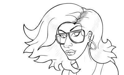 Obviously I started out with a sketch first in pencil, and then inked it. I'm still practicing with different line weights to give cleaner lines and such. But basically, the outline of every major shape gets the thick lines, and the smaller, intricate more delicate lines are the small ones. Sometimes it gets kind of cloudy as to which lines are the larger ones, but hopefully its gonna get better with practice. I did however erase the lines in her neck, nose and the highlites of her hair with an 80% opacity so I don't have to do that color holds technique...but I do need to learn that regardless.
Stage 2:
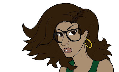 This is the blah part...laying down the flats. Basically, this is the step where I experiment with the base colors and determine whether everything will flow together well or not when things are completed. It helps to use complimentary colors too so things will 'mesh' better.
Stage 3:
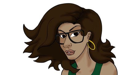 This is where I start to flesh out the picture. I added the shadows here. Its best to set upon a definite light source so things will look right when its finished. I already decided that I want the light source to be in the upper left right behind her wind swept hair, so I placed the shadows accordingly. What I do for the shadows is use a soft brush and color them in with black, and then change the opacity, as well as the layer type, usually either overlay or soft light, depending on which one looks better. A note to the wise though, this works for most colors, EXCEPT yellow and some yellowy oranges. When you use it for those, the colors start to look more dirty than shadows, so for yellows, I suggest using oranges for the shadows. Also, for skin tones, its not enough just using darker colors for shadows, some skin shadows require shades of blue or purples for shadows. I leave those layers as normal, just changing the opacity to what looks right.
Stage 4:
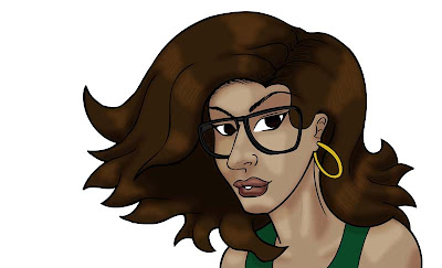 This step is where I apply the highlites. And yes I know thats not how you properly spell it, but that's how I spell it. I use a soft brush with a low opacity just to give me an idea of how light would hit different contours. Usually you can leave this layer as normal, but sometimes its best to check either the overlay or soft light options because those can produce good results as well. These are just the base highlites...
Stage 5:
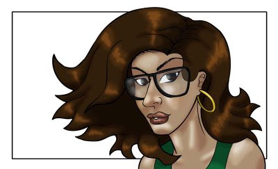 Most people start their backgrounds first...but it makes it look weird to me and I can't concentrate on the colors that I really want to use. Here I knew that I wanted my background framed within a marquee, so I drew that in there with the marquee tool and the stroke option. Here, I added more defined highlites with a slightly higher opacity. The glasses lenses are drawn over the lineart and then set to a low opacity to give that glass look.
Final:
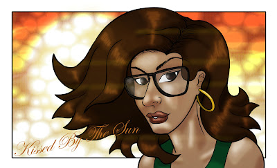 And here's the final. I basically did the background with some marker brushes on a 35% opacity from yellow to dark red, which honestly, could have been done much quicker with a gradient...but whatever. I added the 'sun' in the background with the ellipse marquee tool and filled it with a bright yellow then blurred it. The circles you see are from a screen tone set to multiply, then I added the text. Then I added some horizontal lines with a low opacity and set to color dodge to give that lens flare look. And that's pretty much it. See...anyone can color/draw/create like I can, its pretty easy....
...well, not really, but you get the idea.


2 comments:
Oh wow, I wish I could draw on the computer as well. I've got all the necessary software and even a wacom but it just feels so unnatural for me...
Having said that, awesome job!
Aww...if you don't want your Wacom, I can give you an address that you can send it to...I'm sure it would be used very often. I don't draw on the computer, I sketch and ink all by hand, and color in photoshop/gimp. I wish I had corel painter though. Drawing on the computer does feel so unnatural...especially with an optical mouse.
Post a Comment