Its cool, not very user friendly at first (cause it doesn't tell you ANYTHING) but after doing some research, and playing with it until almost complete meltdown and angry confusion and irritation (thanks babe for putting up with me) I made some sense out of it. I colored my blog avatar, which was black and white at first. Yeah....that's cool....still looks plain...and then I decided to move on up...
This here is a sketch I did with a Bic ball point pen (my new favorite sketching tool...get on it!!). I was content at just leaving it at a sketch and moving on. I thought it looked fine the way it was, but it could look better. So, let me take you through the art process...
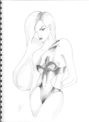 Looks cool right? Yeah, I think I got a handle on crosshatching too...since I started doing it, like what....3 sketches ago? This was one of the pieces that I was gonna put in my sketch book. I thought about doing nudes, but I think I'm gonna stay away from that for now...maybe in the (crossing fingers if successful) next sketch book.
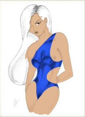 Here, I started coloring it...very sloppily too might I add. Color combo looks cool...diggin the blue swim suit...
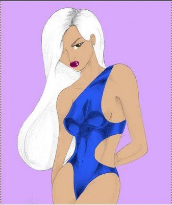 And here I cleaned it up a little bit. Liking the color combination, and added the background. Looking good...but it looks really really flat and dull...like clip art...
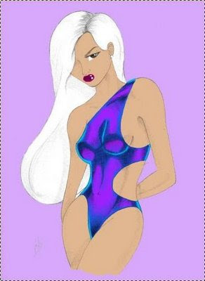 I went a little crazy with the bathing suit, but I like how it turned out. I just gave it a light blue light reflection and a purple undertone so the bathing suit doesn't look as flat and gives it some character. It looks...pearlescent. Thats the word I was looking for. The skin is still looking flat though...
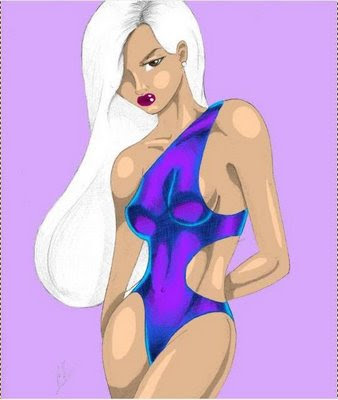 Here, I added some skin shadows and lights. The contrast between them is very stark though.
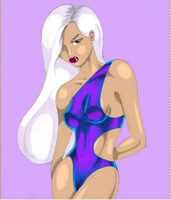 Here, I shaded the highlights of the skin to make them look more smooth, and added purple-ish tones to her hair to make it stand out more and fit the color pattern. The background looks flat, but its cool. This isn't the final version though...the final went to my Girl who was very patient with me, and so I gave her the very best version which isn't posted here. Why isn't it posted? Cause it would loose its 'specialness' if everyone saw it, thats why. But you get this version though...
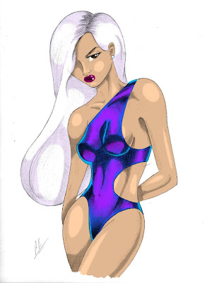
In this one, I overlayed the original sketch over it to darken the lines again so it would stand out. I think the final makes the sketch version look so pale and boring in comparison.
Now that I'm sorta familiar with the coloring process now (this was officially my second coloring, the avatar was the first...), I think I might color alot more of my artwork.
This taught me two valuable lessons...
1.) Drawing with a mouse is fucking hard, and I don't like it AT ALL
2.) I need a Wacom tablet ASAP
...guess I'm not looking too amateurish now though, huh....
-Charles


10 comments:
HAWT!!!! It can only get better from here since this is your first shot!
I WISH I had an artistic bone in my body.
I like this, I don't have an "artistic" eyesight but it looks very well done forget adobe, bic is doing a great job! ;)
I like this sketch!!! the colors give it alot more personality. good job for your second attempt:-)
ok, this is just too cool for words. really. AWESOME.
BTW...Even though these arent all finished products. Don't forget to start watermarking your imagaes buddy! You cant see your sig in all of the pics. ;-)
looks awesome!
vast difference from the 1st drawing to the last
@ Teems- Thanks...yeah I think I'm getting better. And I'll be sure to add watermarks to all of mine from now on...
@Deutlich: Sometimes it can be very frustrating though...
Tuotierugif..: Thanks...I still would rather have Adobe though...
@ 1/3: Thanks...I think so too...it just looks so much better with color.
@ Bloggal: Thanks!!
@ LipstickOne: Thank you...much appreciated!
damnnnn thats hella good! i love it.... i love your drawing, your very talented
hey
well i'll admit i don't like all of the skin shadows. i think you had the experience for me that drawing with a mouse is hard. just discussed with a friend how she spent a semester drawing a 3-d m&m that didn't move. this also made me think of a discussion had with an online graphic artist friend that ragged on my attempt at a logo with paint and told me i was amateur and showed me his photoshop collection. (middle finger was really up)i mean i was using paint
ok i'm done being rose from the golden girls for the night
peace
Post a Comment