Google+

  • Now Selling Prints!!

    I'm now selling prints through Storenvy! Go buy a few!!

  • Follow Illumistrations on Tumblr!!

    Follow me on Tumblr at Illumistrations.tumblr.com

  • Questions or Commission Requests?? Email me!!

    carrington84@gmail.com

  • Follow Me on Twitter!!

    @Illumistrations


Monday, December 22, 2008

Spectacular Spiderman

9 comments:
So, all I've been drawing lately have been females...yeah, I know. But I had to diversify what I draw so I can get better...and to have different stuff for the sketch book too. But ummm...since my ultimate goal is to finally get around to that graphic novel, I had to shift focus again to drawing 'graphic novel' type stuff. So, I drew my favorite (well, used to be favorite anyway) super hero Spiderman. I don't want my graphic novel to come out looking like anything Marvel or DC does (not that there's anything wrong with that, cause their stuff is great) I just want mine to have a different feel and more 'graphic novel-y' I guess. I want mine to have different colors, and weird shading and movement and all of that, stuff you typically don't see in Marvel or DC comics.

I haven't drawn Spiderman in a while, so I'm a little rusty....
Thats the lineart. This took FOREVER because I have the shittiest sketch paper. My paper is somehow scared of ink and my pens don't like writing on it. I was gonna add a city scene and everything to it, which I guess I still want to do...maybe digitally or something. And here's the color...
I guess given the circumstances with my pens, I'm sorta happy how that turned out. There's some stuff that I can tweak here and there, but its cool. And I learned this new trick about adding depth of field and thought I'd apply it to the picture...came out with mixed results...
I think that will look a million times better with a city scene in the back that's out of focus so it will look more visually appealing.
I'm hoping Stan Lee would be proud.


And here's the image thats on my banner, Jack O'Lantern.
The lineart:

You can see the pre-lineart in my previous post. It looks really plain here and for a reason. I'm not gonna lie, the sole purpose for making this picture was to play around in my editing software to see what it could really do. I added some depth of field effects (poorly I might add that I'm going to go over and redo), some glowing effects, and worked more on color blending. It came out...okay I guess.


Okay, well a little better than okay.


-Charles

Thursday, December 18, 2008

1up to the Next Level...

9 comments:
So...I've been busy coming up with new sketches and doing research and yada yada...and somewhere in there I found time to learn how to use this open source painting program. The more I use it, the better I get...which makes that picture in my last post and my avatar look so...I dunno....juvenile in comparison. I've been trying to learn different techniques and getting better at it, as well as drawing so that its conducive to being edited digitally.

So, this first picture is a picture that I was drawing for someone really special. At first, I was going to just draw it and leave it in just black and white in pen, but then I thought "I could do so much more with it...and really take my time with it and make it a million times better...", so thats what I'm doing. I thought about not posting it....but instead, I'm not going to post the final version which has ALOT more going on.

So, here's the initial ink that I was going to give her:

And here's the digitally colored version:

Much better right??

This next one was a sketch done with a Bic ball point pen that I did and was going to leave it at just a sketch...but then decided that I could make it look better than a sketch with color. I kind of like the sketch too because of the simplicity of it.
And here's the colored version:

And finally, here's another picture that I'm working on. I call him Mr. O'Lantern...or Jack on a first name basis. I just drew it to draw something that I normally don't draw, and as an excuse to test out new techniques and stuff. Its closer to final than the version I've posted, but I just want to post the whole thing when its 100% done:

Or if you're really impatient, you can get a preview in my blog banner. ^^^ I guess I can post the steps for that one, cause even though it looks rather simple, alot of thought went into it.


-Charles

Monday, December 15, 2008

Analog in a Digital World

10 comments:
Its no secret that all of my pictures and artwork are done strictly by hand. I thought that was cool, and it had this 'old school' traditional feel to it. Then I've been to several other artists' blogs and seen their drawings on different internet forums and sites, and just about everyone was using Photoshop, Adobe this, Illustrator that...and all of these computer programs that really enhance their artwork. And by comparison, mine all looked so unfinished, amateurish, and just mediocre. But, unfortunately since I'm just 'starting out' in this art thing, I don't have damn near +$700 to drop on an editing program. Then I did some research and came across an open source program called Gimp....

Its cool, not very user friendly at first (cause it doesn't tell you ANYTHING) but after doing some research, and playing with it until almost complete meltdown and angry confusion and irritation (thanks babe for putting up with me) I made some sense out of it. I colored my blog avatar, which was black and white at first. Yeah....that's cool....still looks plain...and then I decided to move on up...

This here is a sketch I did with a Bic ball point pen (my new favorite sketching tool...get on it!!). I was content at just leaving it at a sketch and moving on. I thought it looked fine the way it was, but it could look better. So, let me take you through the art process...

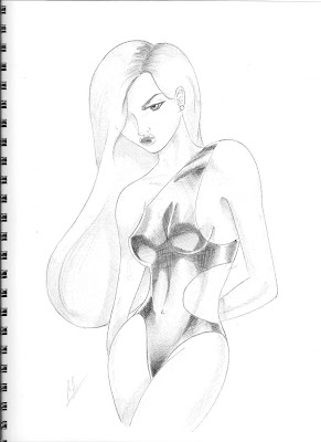
Looks cool right? Yeah, I think I got a handle on crosshatching too...since I started doing it, like what....3 sketches ago? This was one of the pieces that I was gonna put in my sketch book. I thought about doing nudes, but I think I'm gonna stay away from that for now...maybe in the (crossing fingers if successful) next sketch book.
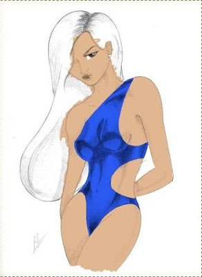
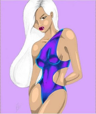
Here, I started coloring it...very sloppily too might I add. Color combo looks cool...diggin the blue swim suit...
And here I cleaned it up a little bit. Liking the color combination, and added the background. Looking good...but it looks really really flat and dull...like clip art...
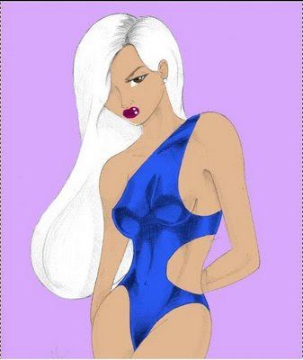
I went a little crazy with the bathing suit, but I like how it turned out. I just gave it a light blue light reflection and a purple undertone so the bathing suit doesn't look as flat and gives it some character. It looks...pearlescent. Thats the word I was looking for. The skin is still looking flat though...
Here, I added some skin shadows and lights. The contrast between them is very stark though.
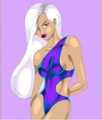
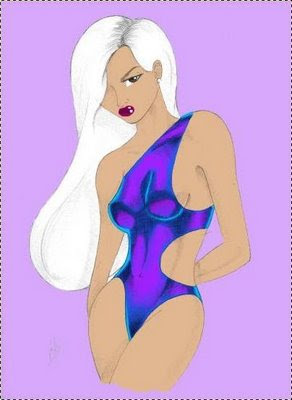
Here, I shaded the highlights of the skin to make them look more smooth, and added purple-ish tones to her hair to make it stand out more and fit the color pattern. The background looks flat, but its cool. This isn't the final version though...the final went to my Girl who was very patient with me, and so I gave her the very best version which isn't posted here. Why isn't it posted? Cause it would loose its 'specialness' if everyone saw it, thats why. But you get this version though...

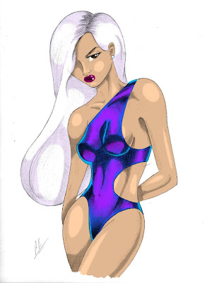
In this one, I overlayed the original sketch over it to darken the lines again so it would stand out. I think the final makes the sketch version look so pale and boring in comparison.

Now that I'm sorta familiar with the coloring process now (this was officially my second coloring, the avatar was the first...), I think I might color alot more of my artwork.


This taught me two valuable lessons...
1.) Drawing with a mouse is fucking hard, and I don't like it AT ALL
2.) I need a Wacom tablet ASAP

...guess I'm not looking too amateurish now though, huh....


-Charles

Wednesday, December 10, 2008

Rehabilitated...Reinvigorated

4 comments:
"Your Honor, I've been rehabilitated, rejuvenated, reinvigrated, reassimilated..." - Carlito Brigante

I love that line from Carlito's Way...

I haven't really blogged in a while on my social blog...mainly because I've been doing alot of art things and focused on getting my art blog, my professional blog, and this publishing thing off the ground. I've been doing alot of sketches recently to practice, and I guess somewhere along the way I lost my writing creativity. I guess that's a good thing...

Now, I'm really excited about drawing, sketching, and just getting better at what I do. I haven't been this excited about art since like middle school. So, in my new creative and artistic mood, I decided to post one of my newer sketches. Nothing too flashy about it....done on lightly textured paper with a Bic pen...just sketching in preparation for the graphic novel. Yeah....straight low budget considering that alot of people use Adobe Illustrator and Photoshop. But, you gotta do what you gotta do.

The art blog is going nowhere. Just the opposite....its here to stay.

-Charles

Saturday, December 6, 2008

End of the Beginning

6 comments:
I started this art blog as an experiment. As I've stated before, I wanted to find other artists and maybe start a social thing with them and yada yada yada. Everything doesn't succeed, and this is one of those non succeeding things. So, my art blog as you know it is done. I'll just chalk this one up to a failed experiment. Nothing that I set out to do was accomplished...except for one goal. My purpose which is clearly stated in my profile, is to 'transform this beyond a hobby'. And I've done that.

Since I've been on different art forums and art pages, I've read what others have been doing and researched how they've gotten their exposure. I'm taking my art to the next level by starting and completing my graphic novel. I've found a publisher that is willing to distribute my work, just as long as its done in an orderly fashion....which is definitely great. My first 'book' that is going to be published is my unofficial sketch book and should be availble soon for purchase if any are interested. And then from there, my graphic novel will be published with hopefully many more works to follow.

It can't be stressed enough how much some of your encouraging words, and especially the ones from my girl have greatly helped. I was on the verge of shutting this site down and giving up hope and just go back to sketching in my book privately. But through here, I found an outlet, a publisher, and hopefully an audience. So I guess, you really do find yourself through failure...which doesn't make this a complete non success.

And because this is an 'art' blog, I felt obliged to share one of my quick sketches. This is of Venom from Spiderman, and took at around 20 minutes to do. Its all practice for the major product that's coming soon.


-Charles

Tuesday, December 2, 2008

Failed (GN) Concepts

1 comment:
Everything doesn't always come out as great as you initially think it will in your mind. So is the story with my initial graphic novel. When I was making it, it didn't have an official name, so I just called it GN Concept. I had story boards worked up, a preliminary story and script, and even had close to 20 pages done before I scrapped it. I might post those, but I guess I have to do that soon huh, since its nearing the end of this experiment. I guess like my initial graphic novel, not everything works out how you envision them to.

Well anyways, my first novel involved too much...I was creating back stories for too many characters, and trying to create this whole universe that was solely held together in one book. I had people from other planets, super humans, everything...and it all came together to make this big mess. Well...it was a learning experience. Anyways, here's the concept art for one of the main characters of GN Concept. He was supposed to be a normal person until he put on an experimental suit which gave him powers when he wore it. But then something happened, and he had powers without the suit anymore, powers that were greater than what the suit initially gave him. Well, I don't want to bore you with particulars, so here is the basic outline I came up with...


Yeah, not too exciting without the inking huh? Well, the final product looks something like...

It looks a lil too anime for me mixed with classic comic art, but, I was going for a unique style.

-Charles

And a special thanks goes out to those who left words of encouragement in my last post, I really appreciate it.